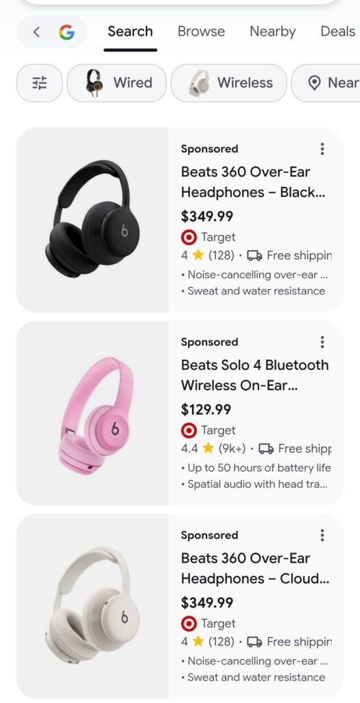
In the Shopping tab, the product image used to sit on top, with name, price, store and reviews below it. In the new design, the image moves to the left and the details sit on the right.
There is a second version too. There, the Sponsored label sits below the image instead of above it.
It was only seen on mobile so far, so the test may be limited to mobile for now. No word yet on how many users see it.
Via Search Engine Watch.